U4A
.png)
United For Afghanistan
Established 2022, U4A is a fundraising initiative partnered with IDRF, one of Canada's top 100 charities, to raise funds for food packs in Afghanistan. The initiative focuses on bringing Afghan and Canadian communities together to support those in need, fostering a sense of unity, compassion, and collective impact through accessible and community driven giving.
The Problem
Building a Brand from the Ground Up
Despite its meaningful mission, United 4 Afghanistan lacked a distinct and cohesive visual identity, making it difficult to stand out, build recognition, and communicate trust across a global audience. With no existing brand identity or logo, U4A had a limiting ability to present itself consistently, build recognition, and establish trust with a global audience. Without a defined visual system, the organization lacked a clear and cohesive way to communicate its mission, values, and presence across digital and physical platforms.
Objectives
- Develop a complete visual system with a clear, recognizable, and consistent presence across all platforms.
- Create a brand that reflects the organization’s values of unity, dignity, and resilience while drawing from Afghan cultural elements
- Ensure the identity functions seamlessly across digital, print, and physical applications
- Build a visual identity that enhances credibility, increases memorability, and fosters stronger connections with donors, partners, and the global community.
The Solution
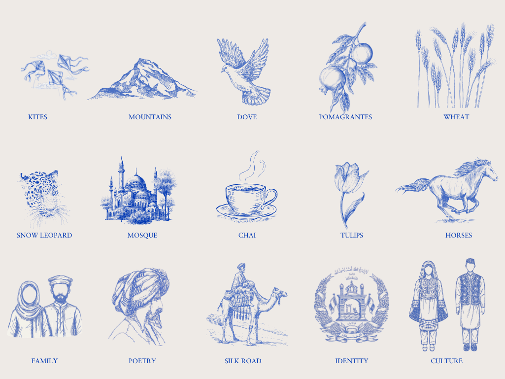
Building a Strong Visual System Through Cultural Inspiration
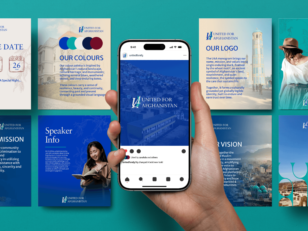
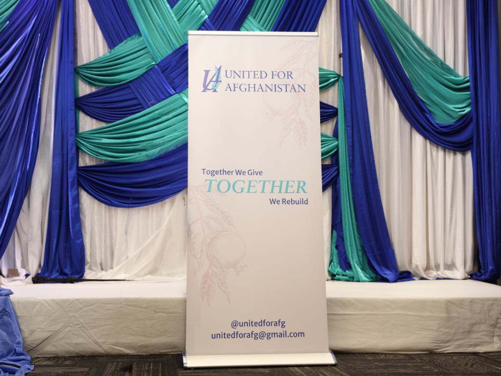
To address this, I developed a complete brand identity for United 4 Afghanistan anchored by a timeless monogram and supported by a cohesive visual system that blends cultural symbolism with modern design. The result is a versatile and recognizable brand that communicates unity, dignity, and trust across all touch points.
Design highlights
- Logo: A bold U4A monogram encircled by a wheat wreath, symbolizing unity, resilience, and Afghanistan’s land and nourishment.
- Typography: A refined serif-led typographic system paired with clean supporting type, creating a balance between heritage and modern clarity.
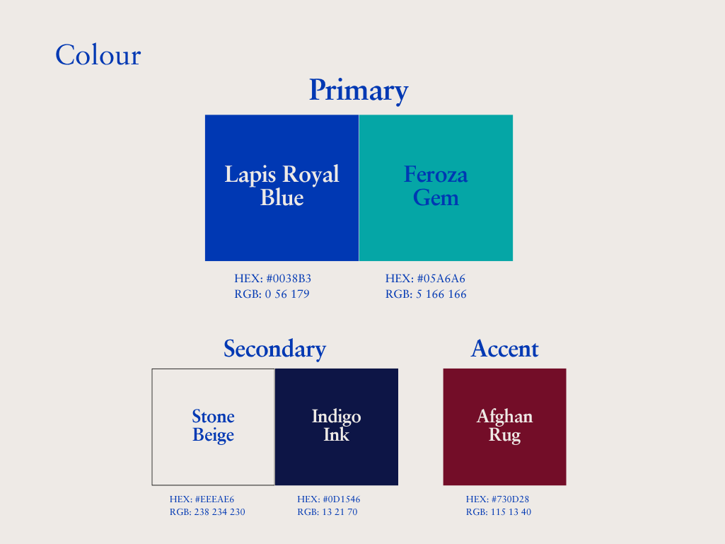
- Colour: A nature-inspired palette drawn from Afghanistan’s landscapes and cultural history, combining deep mineral blues, warm neutrals, and rich accent tones to convey trust, dignity, and hope.


Gallery
No items found.
More Cases